


5 tips to make your garden centre mobile friendly
Edwin Meijer, founder of Garden Connect gives us his five top tips on how you can make your garden centre, mobile friendly
 Print
Print15 March 2017
In today’s technologically advanced world with a new phone or new computer being released every few months it can be challenging to stay on top of growing trends in the mobile market. With more and more of us using smartphones and tablets to conduct business, it is important that you ensure your garden centre sticks with the times and is mobile friendly.
Edwin Meijer, founder of Garden Connect gives us his five top tips on how you can make your garden centre, mobile friendly.
Make sure your website is responsive or adaptive.
“I think you do know what responsive is by now. It means your website layout changes so it fits well on the device visitors use. It has been around for a few years now and this should be on top of your requirement list while renewing your website. Google punishes you hard if your website is not working well on mobile so be sure to get this sorted.
However, the next step is to make your website adaptive. Adaptive means you’re showing different information to mobile users. While on the go, mobile visitors probably wants to know your location and opening hours (of today). They are less bothered about slideshows and huge photos. By making your website adaptive you can show relevant information to users every moment of the day. “
Advertise mobile only
“Back in November, we were wondering if we could generate traffic to garden centres by advertising on smartphones only. We set up a dynamic banner which included directions to our customer. The ads were shown on mobile phones of people in a 10 miles radius around the centre and only between 8 am and 2 pm since most people won’t decide to go to a garden centre at 5.30 pm. Every time people tapped on the banner on their smartphone a few photos were shown and directions to the garden centre.
The result? Within 4 weeks 20,000 impressions, 400 people checked the directions and the costs were less than £120 so that’s about £0.30 per customer. Now that’s effective advertising, isn’t it?”
Use image blocks
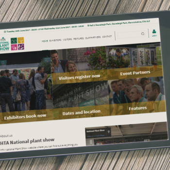
“Since the pointer of the mouse is way smaller than most fingers, it’s important to keep this in mind while designing your website. We’ve been using bigger image blocks over the last few years which makes it a lot easier to navigate websites on tablets and smartphones. Have a look at Alban Hill’s website for example: big, bright boxes which are linking to the relevant content pages. It makes the website looks nice & fresh and it helps mobile visitors to navigate on any device through your website.”
Speed up your website
“Have you ever tried to open a website and it didn’t load fast enough? Chances are you went back to Google to go to another website. That’s what happens if your website too slow. Speeding up your website is important to serve your website as soon as possible to visitors. Of course, this helps desktop visitors as well. Google is also pushing your website higher in the search results if you’re able to speed it up.
But how do you that? Well, have a look at the Google Pagespeed check and discuss the results with your web designer. We’ve been able to push websites to a score of 95% and over by tweaking the technique. Visitors won’t notice this apart from the fact the website is a lot quicker, but you don’t have to remove info from your site in most cases.”
Keep testing
“Visit your own website via your smartphone and check if it’s working well. However, do use other devices as well especially Android devices. Since Apple’s iOS is updated more or less automatically most users are having the same version of it. Android comes in 100’s of different versions so it’s always harder to make websites work well on mobile. Test it on your Samsung but also on a cheap Chinese device you can buy at Tesco for £50.
Also, after testing it initially keep testing your website every time new updates are released to avoid any issues.”
So they are Edwin’s top tips for bringing your garden centre into the mobile friendly world. By taking advantage of these steps, you can grow your market and drive sales by simply accessing an otherwise untapped audience.
While you’re here, check out how planned Amazon stores can benefit the garden centre here.
Related Articles

More than half of Irish farmers had been victims of theft →


Fans 0
Followers